Monday, August 14, 2006

Stay outta the street!

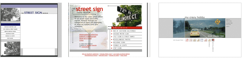
I have a few variations of this kind of "Children Playing" sign, as you can see in the Warning section at mycrazyhobby.com; on the street, there are several more variations.

A few years back, I heard that these rectangular warnings were getting the ol' heave-ho... critics claim that they encourage children to play in the street. (Well, that's just scratching the surface of the real reason.)

So, I snatched these signs up every time I found them in the discard pile at the street department, and built myself quite a collection of duplicates. (Duplicates are not shown on the site.) The funny thing is that, despite their "retirement," I still see brand spankin' new "Children Playing" signs once in a while. I guess they're not making their exit without a few encores.

A great article appeared in Saturday's (August 12, 2006) Journal Gazette, a Fort Wayne, Indiana, newspaper. In the "Road Sage" column, which keeps readers abreast of road construction and closures, a reader asked why the frolicking lad in the "Children Playing" signs is wearing such an old-style outfit. "I've been around for 62 years, and have never seen anyone dressed like the (child in the sign)," the reader points out.

"Road Sage" answers by explaining how these signs are not federally approved or endorsed (hence, its phasing out), and the kid will have to wear his knickers until these signs are retired for good.

You can read the full article here:
http://www.fortwayne.com/mld/journalgazette/news/15259813.htm

Another interesting tidbit not mentioned in "Road Sage" is that the icon of the kid in the knickers is actually outdated in another way. Signs with iconic representations for messages (like the kid running, or children crossing the street to symbolize a school crossing) usually started out with very detailed icons, like the kid in the knickers and hat, and evolved into much more simplified stick-like figures that are better recognized and understood from far distances.

In other words, a driver doesn't need to see the kid's every detail in order to get the message the sign is trying to convey. In fact, these fine details potentially complicate a message that needs to be understood very quickly.

The hard-to-find book "The Design of Danish Traffic Signs" examines the history and redesign of signs using illustrations and icons in Denmark, following their transition from detailed, complicated drawings to simple, easy-to-understand figures. Though Denmark is on a completely different signage system as the States, their minimalist theories behind the design of their signs is very clear.

(Unlike the kid-in-knickers icon.)

Wednesday, August 09, 2006

Red's on top, Green's on bottom, I don't know who's in the middle

I work with some talented people. Art directors, production artists, and creative directors... I'm part of a marketing department that produces outstanding work and whose team is extemely attentive to detail.

One day around the rubber X-acto cutting mat, as we were talking about my sign collection, the conversation turned to stoplights, and how red is always on top. This topic does have a bit to do with my job and the marketing department as a whole, as we were also discussing the importance of consistency in branding.

In the world of traffic control, the consistency standards are defined in the MUTCD (Manual on Uniform Traffic Control Devices). This huge book is the traffic control bible that states, for example, that all stop signs must be eight-sided and red. This is why stop signs look the same just about everywhere you go in the United States. Unfortunately, when you drive in a foreign country that has a different signage system, you're just about screwed.

(Note to self... Print the next full version of the MUTCD on double-sided paper... You'll save a whole tree.)

Anyway, I was shocked when a few of the extremely creative, detail-oriented people I work with every day looked confused when I said that traffic lights are arranged in the order of red-yellow-green, from top-to-bottom. One creative director thought that red was on the bottom. Surprisingly, I think she has an accident-free driving record. She just had no idea... She is oblivious to the world of traffic control standards.

Here I learned a few things: What I thought was common knowledge about traffic signals, really isn't. Then again, I thought every American citizen knew the 50 states and their capitals, but then I found out that half the people I asked didn't even know the capital of the state we live in.

I also realized that I possess a lot of useless detail about traffic signs and signals, like red-yellow-green. But, at least if I ever go color blind, I'll still know when to stop at an intersection.

Tuesday, August 08, 2006

You always remember your first time

OK, here is my first post. The funny thing is, even though I'm a Web designer, I'm new to this blogging stuff.

As the blog description states, I started the official mycrazyhobby.com blog to post random thoughts about the hobby, traffic signs and signals that otherwise would not fit anywhere on the site.

I'll start out with a little reminiscing. I was going through some archaic ZIP disks and came across original designs for the site that I created around 1999. I never was happy with the initial design, and it was about two years before I finally came up with a concept I liked and finally launched the site. (It takes A LOT of Photoshop work to knock the backgrounds out of 250 street sign photos.)

Anyway, from the mycrazyhobby.com archive, here are some old designs:


The first one was designed in 1999, and it is clear that I was on some sort of "zebra stripe" kick. Very, very thin zebra stripes... everywhere. The idea behind the site was to just present general information and photos about old signs and signals, and the content would extend beyond the realm of my personal collection:

The second design was created after I decided that, quite honestly, the first one sucked. So I threw in some red around a couple of filtered street sign images and came up with the middle design.

And I got some pages done, and then decided that this design wasn't really my style. I wanted something minimalist; something contemporary. Like, IKEA. So I launched mycrazyhobby.com in 2003 with a design very similar to the third layout.

I'm finally content with the current design... well, at least for the rest of the year.