Tuesday, March 18, 2008

A new photo sharing community for signs and things

For more than a year, a developer friend and I have been working on a photo sharing site where users can post photos of "roadside relics," or those cool old things you see along the highway - gas stations, drive-inns, diners, railroads, brick streets, traffic signs and signals, factories, water towers, bridges... the list goes on. The older, rustier and vintage, the better.

Appropriately titled "Roadside Relic" (www.roadsiderelic.com), the site launched March 1 with about 500 photos in the collection. Although I uploaded all of these images under my account (user name "mycrazyhobby"), I am hoping that anyone who has an interest in vintage roadside Americana will shoot photos of their favorite relics and share them on the site.

The site allows users to upload and organize photos, tag them with keywords and a description, and rate and comment on other users' photos. I'm hoping that the site will not only appeal to the individual enthusiast, but maybe also to small towns with no budget that have an interesting story to tell through their landscape. Upload photos to the site -- old and new -- and share your town with all of us.

Roadside Relic will help to preserve these rustic pieces of the American highway before they're gone... forever. Unlike my sign collection, which is an inventory that I can manage with relative ease, it is much harder to fit an old gas station, for example, in the garage.

Tuesday, March 04, 2008

Stop sign from Ohio

A co-worker and her husband moved into a house here in Fort Wayne (Indiana), and the previous owners left behind a stop sign in the attic. She knew about my sign collection, so she graciously offered to give the sign to me.

Turns out the Stop sign is an odd one. It looks pretty similar to stop signs of today, but this one uses a different typeface for the word STOP -- the letters are stretched longer from top to bottom than today's standards (compare to today's stop sign).

I remember a sign similar to this while traveling through East Chicago, Indiana, as a kid to visit my grandmother. Not all stop signs in East Chicago looked like this; this one in particular was on Walsh Avenue where it Ts into 148th Street. But I always noticed how the letters were different than all the other stop signs. I consider this my first lesson in typography, at 5 years old.

The photo above is a page from the 1956 Ohio Manual on Uniform Traffic Control Devices, which shows the same kind of stop sign that my co-worker gave to me. There are no other specifications outlined for the typeface except that the letters should be "at least one-third the height of the sign." The typeface, though, is clearly different than all of the other signs in the manual.

Since it's pictured in the Manual, I believe stop signs with this typeface have been used regularly, but are rare now; at least, I have never seen any posted except for the one in East Chicago years ago. I'm glad to have added one to the collection, and by pure luck no less.

Tuesday, February 26, 2008

Signs of Craziness


Dennis Fisher, a correspondent for the Boston Globe, featured mycrazyhobby.com in the Online Finds column in the Home/Lifestyle section.

Read it here »

Friday, February 08, 2008

What do the Beatles have to do with collecting signs?

Back in December, I got an email from a chap called Alex over in the UK. Alex is the producer of a radio program and wanted to know if I'd be interested in doing an interview for the show. We set up a date and they called on a Sunday afternoon (I knew it was them thanks to the crazy, un-American-like phone number on my caller ID), and I chatted with Nick, the show's host, for a good 15 minutes.

We rapped about the usual -- how the collection got started; how many signs I have in the collection; which is my favorite, etc...

But I was just as excited when the conversation turned to the Beatles. Over in the UK, the "Penny Lane" street sign is one of the most sought after by sign thieves, according to Nick. (For those who are not Beatles fans, Penny Lane is a steet where Paul McCartney and John Lennon would meet to catch the bus to the city; they wrote a song "Penny Lane" that was released on the 1967 Sgt. Pepper album.) He wanted to know if there are any signs here in the U.S. that have the same appeal. What is the most coveted sign in the States, he asked.

People over here usually want street signs with their names on it, I explained, or signs that can have a double, mind-in-the-gutter meaning (like High Street or the I-69 shield). But I did bring up that I had read about the Abbey Road sign as being stolen many, many times... so many times that the blokes who run the street department in Westminster finally posted the sign high enough out of reach in order to deter the thieves. (Another Beatles connection, as the group's 1969 album was named for the street/studio.)

Talking about signs and the Beatles on a Sunday afternoon. It doesn't get much better than that.

See the Wikipedia entry about Penny Lane »

Sunday, February 03, 2008

Learning to drive in Jersey, 1950

I bought a New Jersey Driver's Manual that appears to be from the 1950s (there's no date on it anywhere, but I can tell from the design). I purchased it online, which is sometimes a gamble since you can't flip through the book before you buy it, but I'm rarely disappointed.

This one has two pages of signs and some 1950s-style illustrations throughout. The drawings of the cars, gas station attendants, and even the top coat and hat of the male figures throughout reflect a simpler time.

It's fun for me to see how traffic control has changed since this manual was published. Case in point: "(The stop sign) is eight-sided, or octagonal, in shape and contains the word 'stop' in black letters on a yellow background." There's no mention of white letters on a red background, which means that this manual was published well before 1954, when the design changed from yellow to red.

Visit the Stop & Yield section at mycrazyhobby.com »

Thursday, January 24, 2008

Lights, Camera, Action

Lots of cool stuff on YouTube, if you can get past all the garbage. Sometimes you have to dig deep. I'll be posting some cool street sign and traffic signal-related movies in the new Video section at mycrazyhobby.com.

Wednesday, January 23, 2008

Has it been that long??

OK, so 2007 was a busy year... Probably the fastest year of my life.

I was in San Francisco for the MacWorld Conference in January, where us Mac folk drooled as Steve Jobs gave us a live demonstration of the iPhone, and then John Mayer gave us a live performance of "Waiting on the World to Change."

Then I was in New York in February and stood outside the Today show with a co-worker in sub-zero temperatures. It was so cold that day that Matt Lauer made "an executive decision" and invited all of about 15 of us to crowd into the studio to watch American Idol's Randy Jackson be interviewed. (Ironically, Journey is playing on my iTunes at this moment, and I just got done watching American Idol on this Tuesday night.)

I was in Denver in March (not much excitement there); bought a house in April; married in June; honeymoon to Antigua in November; and closed the year with the worst cold of my life.

So what about all the signs, you ask? Like all of the traffic signals in Muncie, Indiana, my collection has been severly neglected. After all of the expenses that come with buying a home and being married, purchasing new pieces for the collection has been put on hold. And after the whirlwind of 2007, updaying mycrazyhobby.com was put on hold, too.

Visit the "News & Updates" section... Last updated in September 2006??? You're kidding! I had no idea that it has been that long. I feel like such a slacker.

Well, something lit a fire under my ars and I'm back in front of my iMac making edits to the site. (Hey, I'm even taking time to update the almost-forgotten Blog.) I ditched the JavaScript pop-up windows in favor of a sleaker popup module known as Lightbox. I still need to update the site with some new signs and things, while also going through the photo archives and publish each sign's "large view." I also have long-term plans for a new section that will house a collection of signs have found across the web (don't get excited... it will take me a while.)

So thanks for actually coming back to the site, and thanks for reading this Blog. Stay tuned for more updates.

Thursday, September 07, 2006

In the beginning, there were train sets

When I was young, I obviously wasn't able to drive myself to the street department or flea market in search of old street signs. Sure, I was given a few here and there by people who thought it was "cute" that I liked signs so much, but those instances were few and far between. (Alas, they were some of the greatest days of my childhood, not to mention that these signs were the foundation of what would eventually become my current sign collection.)

But there were train sets. And with train sets come accessories, including miniature street signs (a.k.a. train set signs).

One Christmas, my sister and brother-in-law gave me a Tyco HO-scale train set. It was in the shape of an oval, and came with about 5 cars and an engine. This was the only train set I ever owned. Needless to say, I had train set signs long before the train set.

I'd set up train set signs all over the floor, pull out my Hot Wheels and drive them around the carpet. Oftentimes, the signs would get stepped on and break from the base, but my mom had a great fix: She'd heat up the bottom of the "sign post" with a small flame and melt the sign back to the post, and it was good as new again.

I still have the signs, along with an assortment of telephone poles, packed away somewhere. It's interesting to see how "to scale" they are to real street signs - the toy manufacturers seem to follow the MUTCD standards as strictly as the federal highway department. Here's one of my favorites: a pole-based traffic signal with a "Don't Walk" pedestrian light.

Monday, August 14, 2006

Stay outta the street!

I have a few variations of this kind of "Children Playing" sign, as you can see in the Warning section at mycrazyhobby.com; on the street, there are several more variations.

A few years back, I heard that these rectangular warnings were getting the ol' heave-ho... critics claim that they encourage children to play in the street. (Well, that's just scratching the surface of the real reason.)

So, I snatched these signs up every time I found them in the discard pile at the street department, and built myself quite a collection of duplicates. (Duplicates are not shown on the site.) The funny thing is that, despite their "retirement," I still see brand spankin' new "Children Playing" signs once in a while. I guess they're not making their exit without a few encores.

A great article appeared in Saturday's (August 12, 2006) Journal Gazette, a Fort Wayne, Indiana, newspaper. In the "Road Sage" column, which keeps readers abreast of road construction and closures, a reader asked why the frolicking lad in the "Children Playing" signs is wearing such an old-style outfit. "I've been around for 62 years, and have never seen anyone dressed like the (child in the sign)," the reader points out.

"Road Sage" answers by explaining how these signs are not federally approved or endorsed (hence, its phasing out), and the kid will have to wear his knickers until these signs are retired for good.

You can read the full article here:
http://www.fortwayne.com/mld/journalgazette/news/15259813.htm

Another interesting tidbit not mentioned in "Road Sage" is that the icon of the kid in the knickers is actually outdated in another way. Signs with iconic representations for messages (like the kid running, or children crossing the street to symbolize a school crossing) usually started out with very detailed icons, like the kid in the knickers and hat, and evolved into much more simplified stick-like figures that are better recognized and understood from far distances.

In other words, a driver doesn't need to see the kid's every detail in order to get the message the sign is trying to convey. In fact, these fine details potentially complicate a message that needs to be understood very quickly.

The hard-to-find book "The Design of Danish Traffic Signs" examines the history and redesign of signs using illustrations and icons in Denmark, following their transition from detailed, complicated drawings to simple, easy-to-understand figures. Though Denmark is on a completely different signage system as the States, their minimalist theories behind the design of their signs is very clear.

(Unlike the kid-in-knickers icon.)

Wednesday, August 09, 2006

Red's on top, Green's on bottom, I don't know who's in the middle

I work with some talented people. Art directors, production artists, and creative directors... I'm part of a marketing department that produces outstanding work and whose team is extemely attentive to detail.

One day around the rubber X-acto cutting mat, as we were talking about my sign collection, the conversation turned to stoplights, and how red is always on top. This topic does have a bit to do with my job and the marketing department as a whole, as we were also discussing the importance of consistency in branding.

In the world of traffic control, the consistency standards are defined in the MUTCD (Manual on Uniform Traffic Control Devices). This huge book is the traffic control bible that states, for example, that all stop signs must be eight-sided and red. This is why stop signs look the same just about everywhere you go in the United States. Unfortunately, when you drive in a foreign country that has a different signage system, you're just about screwed.

(Note to self... Print the next full version of the MUTCD on double-sided paper... You'll save a whole tree.)

Anyway, I was shocked when a few of the extremely creative, detail-oriented people I work with every day looked confused when I said that traffic lights are arranged in the order of red-yellow-green, from top-to-bottom. One creative director thought that red was on the bottom. Surprisingly, I think she has an accident-free driving record. She just had no idea... She is oblivious to the world of traffic control standards.

Here I learned a few things: What I thought was common knowledge about traffic signals, really isn't. Then again, I thought every American citizen knew the 50 states and their capitals, but then I found out that half the people I asked didn't even know the capital of the state we live in.

I also realized that I possess a lot of useless detail about traffic signs and signals, like red-yellow-green. But, at least if I ever go color blind, I'll still know when to stop at an intersection.

Tuesday, August 08, 2006

You always remember your first time

OK, here is my first post. The funny thing is, even though I'm a Web designer, I'm new to this blogging stuff.

As the blog description states, I started the official mycrazyhobby.com blog to post random thoughts about the hobby, traffic signs and signals that otherwise would not fit anywhere on the site.

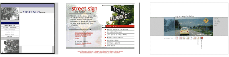
I'll start out with a little reminiscing. I was going through some archaic ZIP disks and came across original designs for the site that I created around 1999. I never was happy with the initial design, and it was about two years before I finally came up with a concept I liked and finally launched the site. (It takes A LOT of Photoshop work to knock the backgrounds out of 250 street sign photos.)

Anyway, from the mycrazyhobby.com archive, here are some old designs:


The first one was designed in 1999, and it is clear that I was on some sort of "zebra stripe" kick. Very, very thin zebra stripes... everywhere. The idea behind the site was to just present general information and photos about old signs and signals, and the content would extend beyond the realm of my personal collection:

The second design was created after I decided that, quite honestly, the first one sucked. So I threw in some red around a couple of filtered street sign images and came up with the middle design.

And I got some pages done, and then decided that this design wasn't really my style. I wanted something minimalist; something contemporary. Like, IKEA. So I launched mycrazyhobby.com in 2003 with a design very similar to the third layout.

I'm finally content with the current design... well, at least for the rest of the year.